Chapter 2 (from the Book)
Modeling Internal Customer Survey Data to Identify Inconsistencies & Deficiencies in Menus
Despite having easy access
to the customer response surveys, most non-chain dining establishments do not
collect any such data. Even when they do, they rarely spend any time and money
mining the data; instead, they depend heavily on macro industry data and
research in combination with some unscientific samples derived from anecdotal opinions
and responses.
Obviously, random business decisions,
including menu planning, based on such general solutions tend to produce hit or
miss results, often adversely impacting customer acquisition and retention,
lessening the prospect of long-term growth and expansion. Hopefully, the new
generation of data savvy entrepreneurs will look more closely into their own
internal data to decide on competitive strategy, absent which they will risk
being part of the strikingly high small business failure statistics.
Two days after the first business meeting with John and Priya, ChefQuant was pleasantly surprised to see an envelope on his desk with a handwritten note, “Please model it out.” As he looked at the content of the media on his computer he realized it was their internal customer survey data that Priya had seemingly started to research. The timing couldn’t be any better as ChefQuant was looking for a new project for his new batch of interns. A veteran intern was given the lead to indoctrinate the new batch into their new world of culinary data science.
ChefQuant was proud to see
that under the able leadership of the veteran intern the new team developed the
initial model in two days. He was taken aback by certain findings so he
immediately called John and set up a meeting to share the modeling results. The
following morning as John and Priya showed up ChefQuant decided to explain
their research methodology before getting into the actual results.
ChefQuant explained, “First
off, thanks to Priya for providing us the data in soft format so we didn’t have
to do the data entry. Although she has given us six months’ worth of data, our
initial analysis of the data pointed us to its consistency, thus encouraging us
to work out of a random sample of 100 cases instead of the entire population
itself. FYI, a quality representative sample is as good as the population.”
Priya was curious, “What’s
the difference between a quality sample and a perfect sample?”
ChefQuant pointed out,
“There is no such thing as a perfect sample. A perfect sample is the population
only. A quality sample, on the other hand, is one that is statistically
significant, hence heavily relied on in data modeling. That is why most Stat or
Econ professors generally avoid using the term ‘representative sample’ because
a sample, by definition, is representative of the population. Of course, our
clients are mostly business owners so we take a more colloquial approach in our
presentations. Now that you have an understanding of the methodology, let me start with this simple
frequency table that summarizes the survey data.”
 |
| (Click on the graphic to enlarge) |
ChefQuant continues, “Given
your restaurant’s popularity and positioning, I was not too happy to see scores
below 4. While this table doesn’t show the median, the median score checked in
at 4.50, with 19% customers rating the overall experience as perfect. Obviously, there is
significant room for improvement, which the following correlation matrix
demonstrates.
 |
| (Click on the graphic to enlarge) |
The overall score (“Score”) and your offerings must be collinear. In fact, the scores in all of the individual categories must always be above .85, ideally above .90. Honestly, it is shocking that Beverage and Dessert categories are hovering around .60. Going by our internal metrics, I would reason that the Wine List you are offering is not properly complementing your entrées while the formulary dessert combinations are not adequately appreciated or promoted. In your type of environment, the correlations between entrées and other menu items must be above .60 and even higher for presentation. The low correlation between Dessert and Presentation is clearly another red flag.
 |
| (Click on the Graphic to enlarge) |
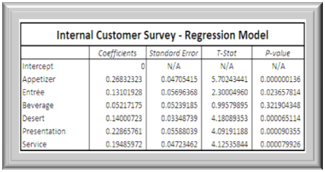
Now let’s move on to the regression model. The reasonably high predictive relation between Score and the other variables, as evidenced by the correlations matrix, paves the way for a reliable regression model. In this model, Score is called the dependent variable while the other variables are called independent variables. These independent variables, collectively, help explain the variations in the dependent variable. Unlike the correlations matrix which depicts the existing relationships, this is a predictive model that evaluates all of the independent variables as a group.
Even the model is revealing
that Beverage is the weakest candidate in the group, with the weakest
coefficient and T-Stats and high P-value. Conversely, Appetizer is the
MVP with the strongest coefficient and T-Stats along with low P-value. The reason is
quite simple: Your customers come to a place like yours for a memorable
experience which obviously starts with the appetizers. Amazingly, the model is
predicting that Dessert could be the next best candidate in the lineup by
projecting its high T and low P, but it’s not there yet as it carries a weaker
coefficient than those of Presentation and Service. The fact that Entrée hasn’t
fared well is self-fulfilling in that it needs to be better coordinated with
Beverage and Dessert.
 |
| (Click on the graphic to enlarge) |
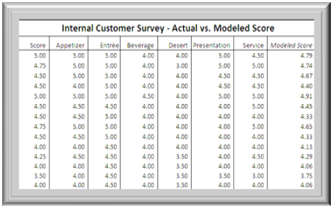
Finally, take a look at the above scorecard presenting the first few responses from the sample. Remember, once you have the modeled scores, you must use them in optimizing any process or menu as they are statistically more significant, with reduced judgments that are inherent in all opinion surveys. For example, the first respondent gave you a perfect 5, though two categories contain straight 4s, whereas the model returned a more meaningful 4.8. Again, consider the last but one where you received an overall score of 3.50, while the model revised it up to 3.75. Well, that’s all I have on this. Any questions?”
John asked, “So, what’s the
fix, ChefQuant? Where do I start?”
ChefQuant’s answer was
quite simple, “Share the analysis with your beverage manager and try to
understand where the disconnect is. If that doesn’t help, I will hook you up
with a wine consultant friend of mine who specializes in coupling wines with
entrées. He is very good at it. Then, after your Chef leaves, let Priya spend
some time with your Pastry Chef and figure out the underlying issues. If the current
dessert menu lacks proper flow-through, overhaul it. Also, do some role playing
with your service staff to making sure they are using the right pitch in
promoting the current dessert menu.”
John remarked, “I have to
get something off of my chest. Now I know why my banker repeatedly asked me to
consult with you, ChefQuant. This is the kind of class I had in mind when I had signed up
for the Applied Finance class in my undergraduate. Instead, the professor spent
an entire session manipulating an alpha which I could hardly see from my seat. I never
knew applied science could be so much of fun, yet so incredibly meaningful.”
No comments:
Post a Comment